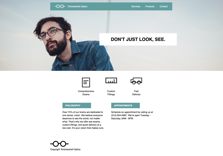
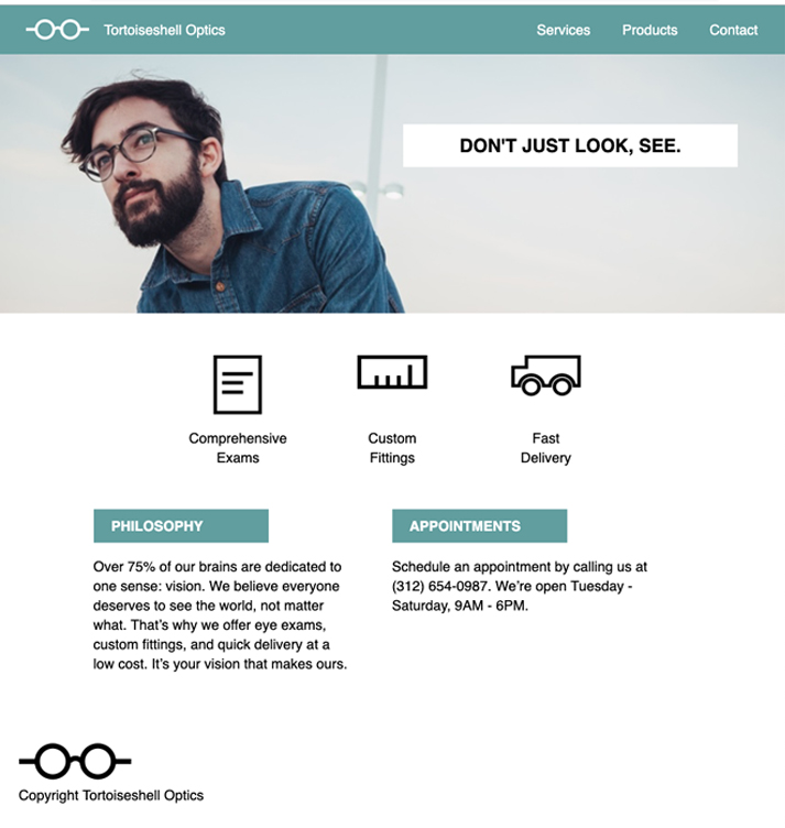
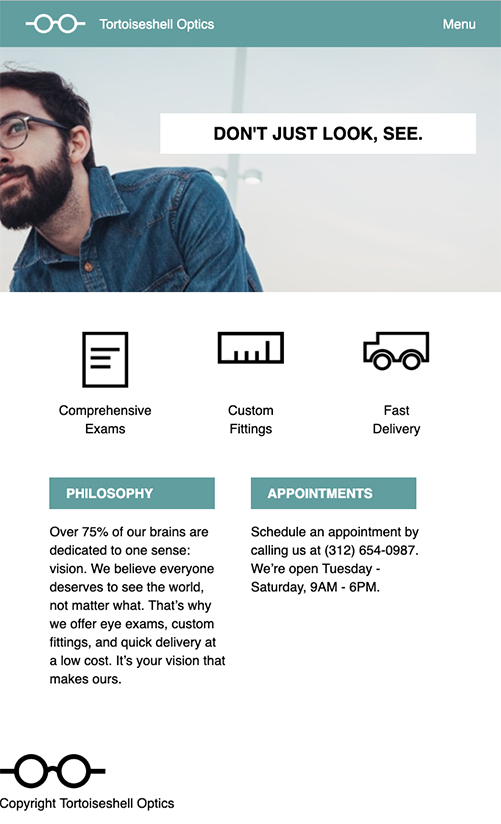
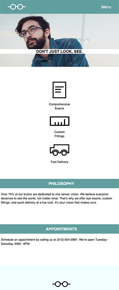
Tortoiseshell, This webpage has a few different tricks. Once I learned how to make a responsive site. Editing a full desktop page into a mobile size, had to edit this small project by reading pixels and seperating items to a certain size. Creating this page out of scrach and following instructions. Images start from left to right, followed with second colum as third and fourth. This page is responsive feel free to play with it. First image is the webpage at desktop size. Second image is on laptop screen size. Third image would be tablet size and last would be mobile size. Click here to see live webpage. Click back button when done :) .